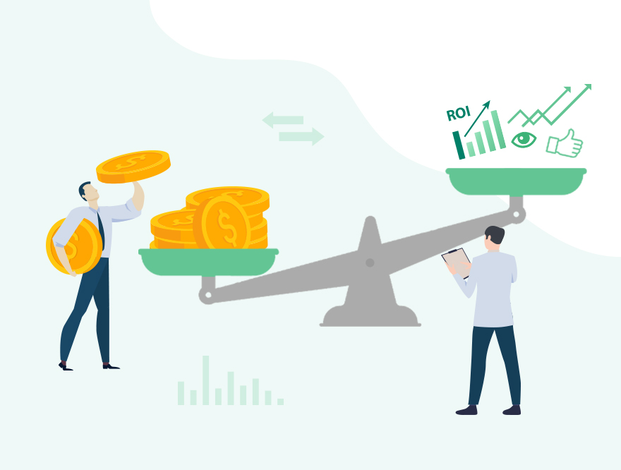
Advertising is partly about paying for more traffic to your site, but your ultimate goal is to get people to buy your product or service. If your landing page is bad, no matter how many people the advertisement attracts, the bounce rate will remain high, meaning your ads will be burning cash instead of making it.
So, before you start advertising, make sure you do everything you can to learn how to optimize and improve your landing pages for conversions. Think about it, if you earn US$12,000 by getting 1,000 visitors at 1% conversion rate with your ads, imagine how much you’ll earn if it were 2% or more instead.
The obvious answer is more profit! A good conversion rate is hugely affected by the quality of your landing page, and this guide aims to unveil the four key tips to keep in mind the next time you are creating one.
1. Optimize for Speed (Core Web Vitals)
Using a simple design for your webpage is a given. But modern landing pages today must also prioritize performance. Every second of delay can cause conversion rates to drop significantly.
Focus on Core Web Vitals (CWV)
To ensure your page delivers a great user experience and performs well in search, focus on Google's three key metrics:
- Largest Contentful Paint (LCP): How fast the main content loads (Target: under 2.5 seconds).
- Interaction to Next Paint (INP): How quickly the page responds to user actions (A measure of responsiveness).
- Cumulative Layout Shift (CLS): How visually stable the page is (prevents elements like buttons from jumping around).
Key Optimization Steps
To maintain a fast landing page design:
- Reduce Asset Size: Compress and size images correctly. Load media only when necessary.
- Code Cleanliness: Minimize third-party scripts and complex animations that block the rendering of essential content.
- Mobile Priority: Always test speed on mobile connections first, as this is where most paid traffic originates.
2. Perfect Your Value Proposition and Headline Strategy
Your headline is the first, and often the last, chance you have to hook a visitor. It must immediately answer the visitor's core question: "What's in it for me?"
While the title must be concise and eye-catching, the main goal is clarity and immediate communication of your Unique Value Proposition (UVP). The UVP is a clear statement that explains the specific benefit you offer, how you solve the customer's problem, and what makes you different.
Clarity Over Cleverness
- Message Match is Key: Ensure your headline exactly matches the promise or keywords used in the ad that drove the traffic. Any disconnect between the ad and the landing page will create friction, potentially harming the conversion rate in the process.
- Avoid Jargon: Stick to clear, direct language. Avoid homophonic words, puns, or overly complicated corporate terms that force the user to think or guess. Write your mind and express your service as clearly as possible.
- Feature-to-Benefit: Translate your product features into tangible benefits for the user. Focus on the result they will achieve, not just the function of your product.
A well-crafted headline and UVP are the foundations of a successful landing page design for conversion.
3. Build Trust with Credibility and Social Proof
At the most basic level of landing page best practices, clear copywriting is a non-negotiable. But it’s only half the battle. Today, your copy must be clear and credible to build trust, as it is the essential bridge to conversion.
To truly understand how to optimize landing page performance, you must move beyond simple descriptions and provide undeniable evidence of your value:
-
Implement Social Proof: Integrate specific, powerful elements that reduce risk and build confidence:
- Testimonials: Use genuine quotes that focus on the user's results (not just how nice the product is).
- Trust Seals and Logos: Feature logos of well-known partners or clients, security badges (e.g., SSL), or "money-back guarantee" seals.
- Quantifiable Results: Use numbers, statistics, and case studies (e.g., "Helped 5,000+ businesses achieve X").
- Focus on the User's Problem: Structure your copy to address the pain points that drove the user to your page. Position your product as the clear, trusted solution to that specific problem.
- Maintain Scannability: Use short paragraphs, bold text, and bulleted lists. Even the clearest message is useless if the visitor can't quickly scan and absorb the main points.
4. Guide the Eye with Visual Hierarchy and CTA Optimization
The purpose of visual elements is not just to attract attention, but to direct it. Your landing page visuals (images, forms, whitespace, buttons) must work together to create a smooth path straight to the conversion goal.
A core part of knowing how to improve landing page conversions lies in designing an intuitive visual hierarchy that minimizes friction and maximizes focus on your Call-to-Action (CTA).
Optimize the Visual Path
- CTA: The Call-to-Action button must be the most visually dominant element on the page. Use contrasting colors that stand out from the background and ample whitespace around the button to make it pop.
- Direction: Use directional cues (like arrows, lines, or even images of people looking directly at the form or CTA) to guide the visitor's focus.
- Keep it Simple: Only ask for the absolute minimum amount of information required to fulfill the next step. Every extra field is a barrier to conversion.
- Relevance: Ensure all images and videos are high-quality and directly relevant. They should illustrate the product in use or the result the user will experience, reinforcing the copy and the UVP.
- Prioritize Above the Fold: Ensure the primary CTA, headline, and form fields are easily accessible, preferably above the fold (visible without scrolling).
Real-World Examples: Landing Page Design for Conversion in Action
Enough talking of theories, let’s look at two successful examples that apply these landing page best practices.
1. Codecademy (Code-Learning Education)

Codecademy’s latest homepage design
The latest Codeacademy homepage demonstrates a powerful and modern landing page design. Upon landing on this page, you’ll immediately notice a high-contrast yellow banner promoting a time-sensitive event, with a specific coupon code. In this example, a "CYBER WEEK SALE" event is being held in conjunction with Black Friday/Cyber Monday. The prominent countdown timer drives immediate action, leveraging psychological triggers for conversion. The main headline is an animated image focused on the user’s goals, whether it be upskilling, team building, or career progression. This makes the value of signing up crystal clear.
Lastly, the site features clear, primary calls-to-action (CTA), such as the "Sign Up" button and the "Join Pro" button within the sale banner, ensuring the conversion path is instantly accessible and highly visible.
2. Trello (Project Management Tool)
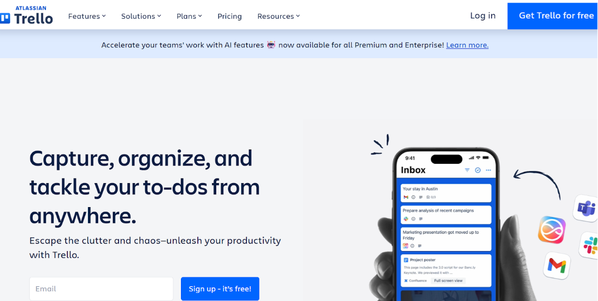
Trello’s current homepage design
Trello’s homepage showcases a clean, benefit-driven approach with clear value proposition. The headline, "Capture, organize, and tackle your to-dos from anywhere," along with the sub-headline ("Escape the clutter and chaos—unleash your productivity with Trello."), immediately defines the primary benefit of the product. The page also prominently features a dual CTA: a clear "Get Trello for free" button in the header and a highly accessible email form followed by a specific, low-friction button, "Sign up - it's free!", demonstrating a direct path to immediate conversion.
To cap it off, a high-visibility banner highlights new AI features, catering to enterprise needs and showcasing continuous product evolution, which builds trust and encourages upselling.
Landing Page Design for Conversion: A Recap
Landing page quality is like the engine of a high-performance car; if it's polished and tuned, it will drive your advertising performance significantly. If it's neglected, it will hugely hinder your entire marketing function.
Don’t ever neglect the importance of focusing on user interface, technical speed, and strategic design. With the four principles outlined above, you are taking the necessary steps to improve landing page conversions immediately.
Remember, optimization is not a one-time project; it is a continuous process. Consistently measure and test your page elements to ensure your landing page conversion rate is always climbing, turning more of your ad spend into revenue.
Improving your landing pages is only half the battle. Now that you know how to build a better landing page, pair these tips with OptAdEasy’s precision ad management to ensure every click turns into profit. Sign up for a free trial today!